█
Pana Holding Branding
Logo redesign and branding for Pana Holding and its sub-brands, operating in a wide range of businesses from TV production to construction and real estate.
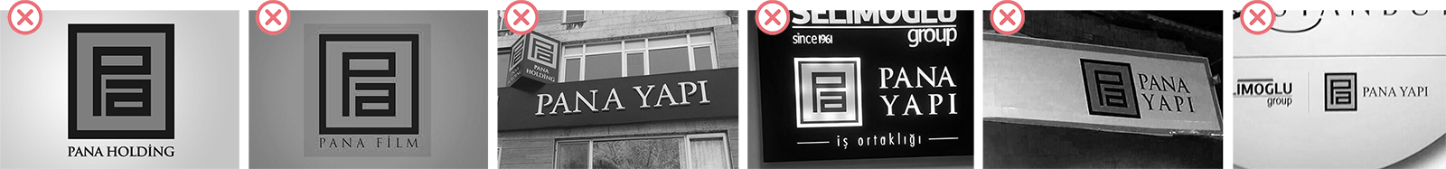
Pana Holding and its many subsidiaries were in need of a cohesive visual identity. Although the "Pa" sign itself was very well established and regarded, many random variations of it were in use. The brand was lacking the rules and guidelines for a unifying identity.
█
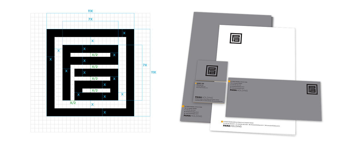
New, redesigned logo system:
It was only natural for the brand to want to keep the well established "Pa" sign, so we kept it as the main element. By adjusting the proportions, deciding colour and size variations and defining the relationship of the sign and the type, new standarts for all existing and possible future Pana brand logos were set.

█
Old, disorganized usage:
█
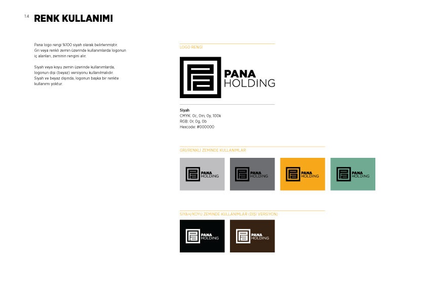
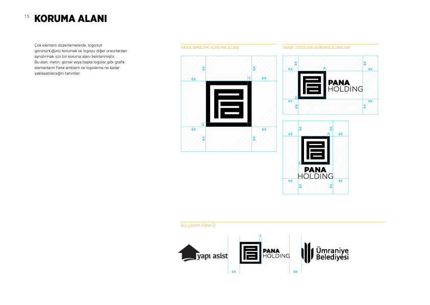
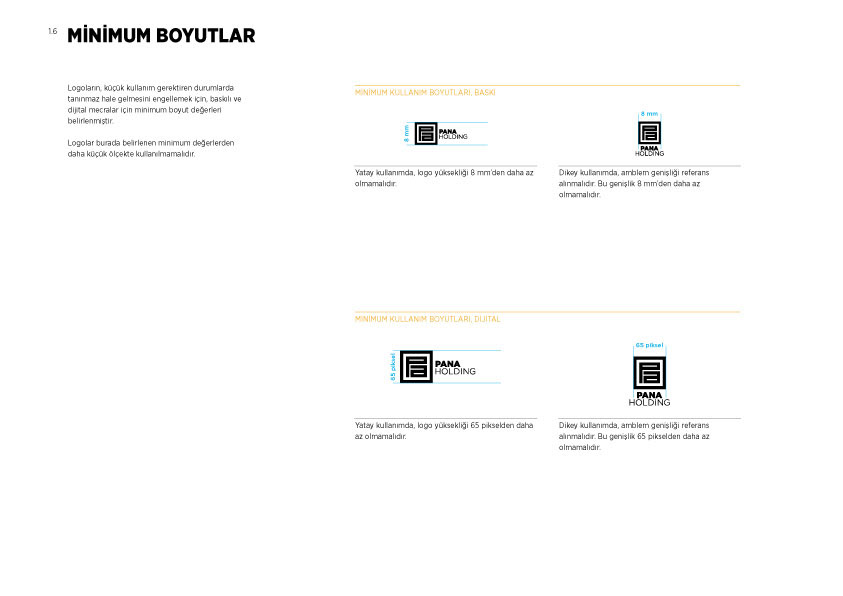
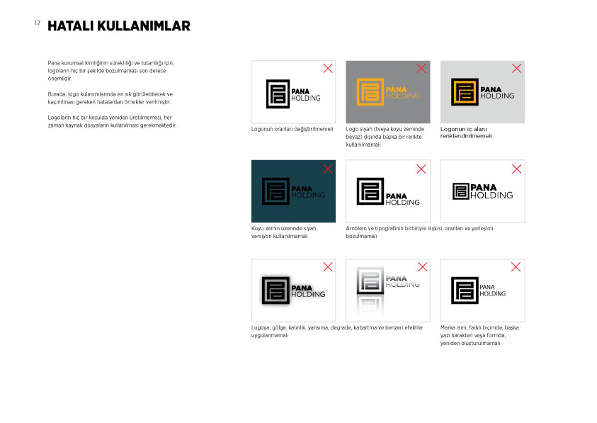
Guidelines regarding logo usage:
█
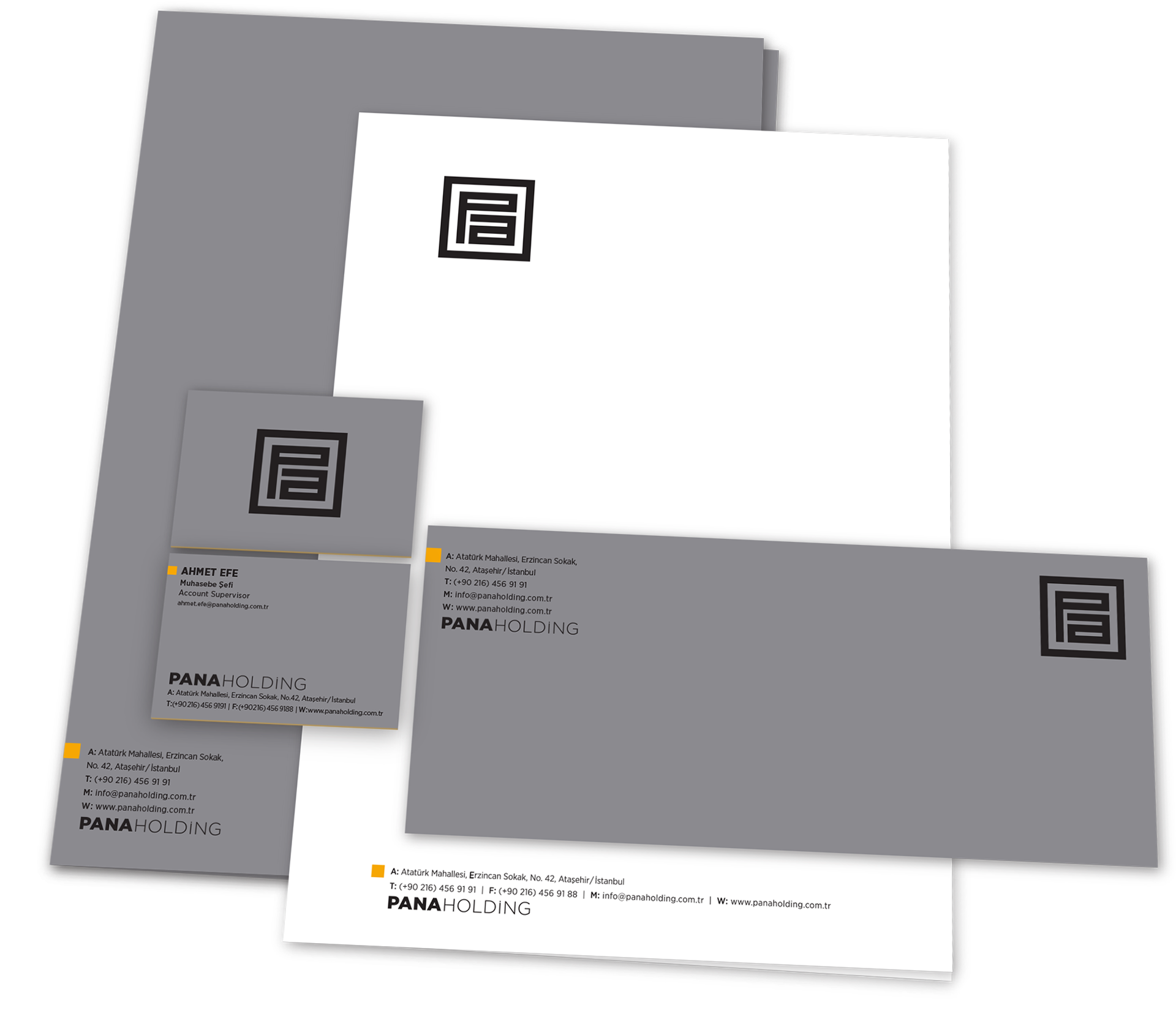
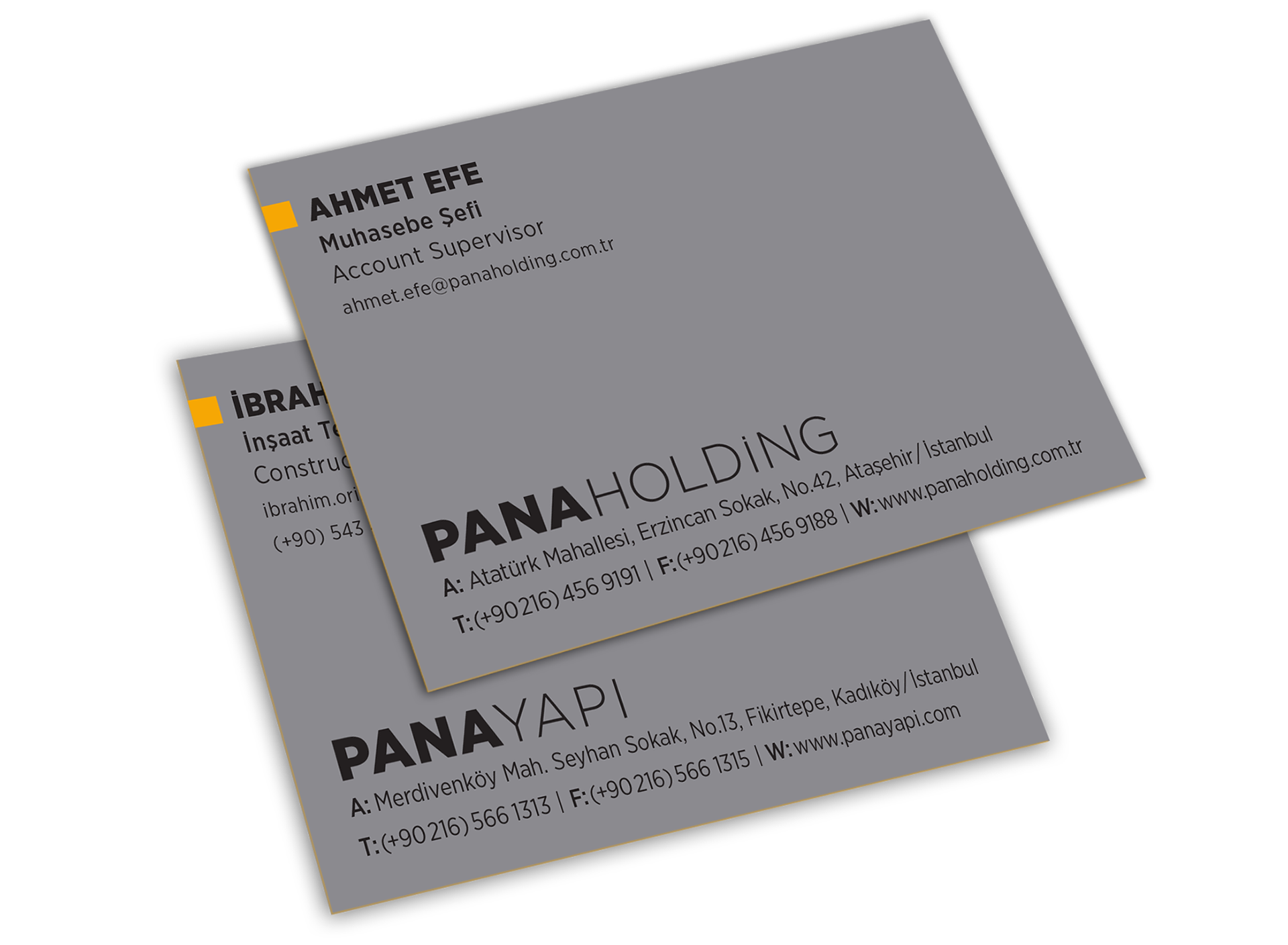
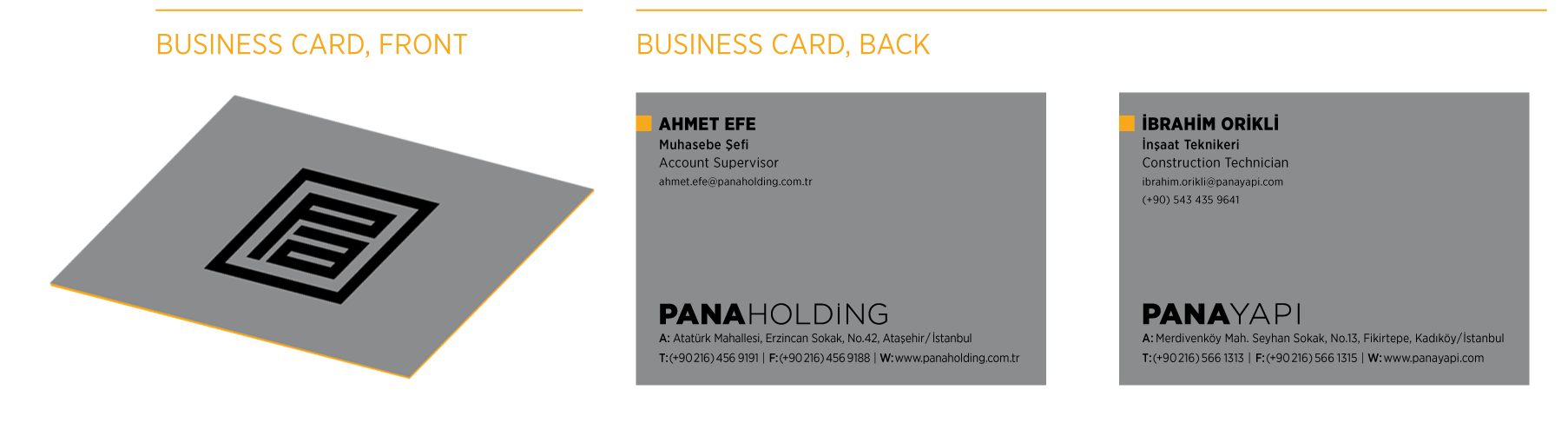
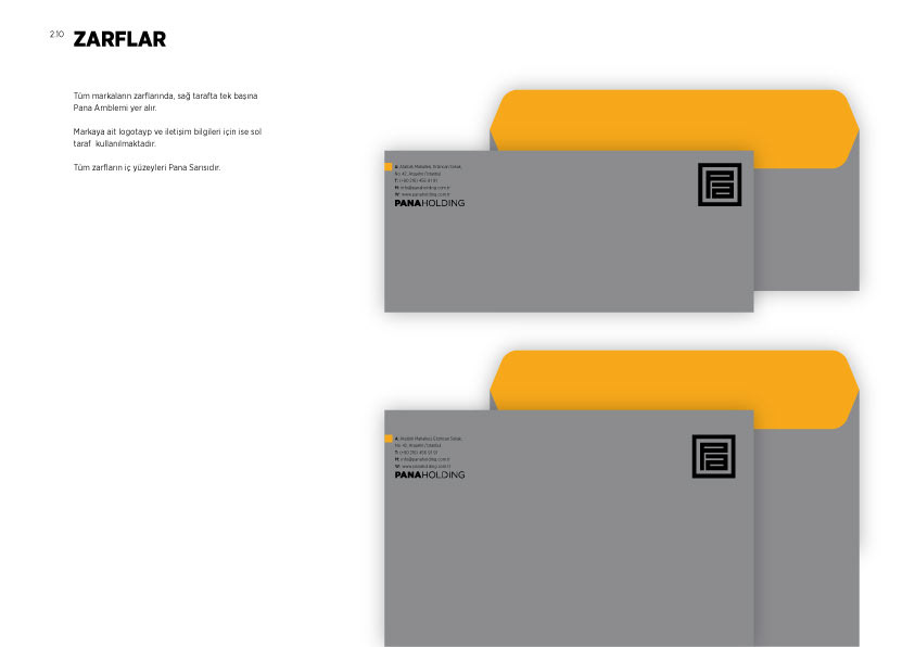
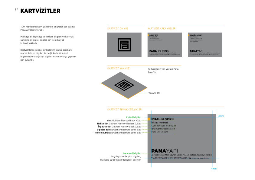
Stationary elements and general guidelines:
The idea for the stationary elements was to communicate that, whatever business the specific sub-brand operates on, it was a Pana brand first and foremost. Thus, the design uses the Pa sign as the main element unifying all brands, with classy black and grey as the main colors and a delicate touch of yellow.